Wednesday, December 8, 2010

James Balog Lecture

My notes from the James Balog lecture. Wish he'd shown some of his work there

Company Capabilities Brochure


I made a mock up of brochure using the pagination from my design brief and applying it to a miniature paged paper brochure. This helped me to better visualize layout possibilites as well as page order of the brochure easier


An outline of the Capabilities Brochure content


More notes for Brochure design


 With my brochure design i pictured encorporating the "3" aspect of some earlier designs. I also wanted to include my "what are you looking for, what you are looking for" dychotomy. At first I had the grid of my brochure divided into 3 vertically, and it did end up having 6. I also thought of limiting the number of elements to pages to 3 but thought different later on. There are still many aspects incorporating the number 3, including elements on the website page and some of the brochure pages

Brochure Cover


Inside cover
Brochure Pages


Back Inside Cover

I had envisioned my company doing much more. I pictured  that in the future my company would also have their own specific locations where people who meet on the website could meet. And I thought people could also find discounts or coupons for their local eateries, restaurants and other places for social activities through the website where these companies would advertise. I think I missed the boat in some regards with my brochure design and can already see many changes I would make to it but overall I think its a good foundation for the company capabilites brochure and think it works in many ways.


Company Product Packaging

Again, as far as products for my company, I felt at the time that it was more of a service provider than a producer.


This was a rough layout for some of my companys' website pages.


This is a comp(what for a moment I thought the final design) for either the enter page or main page of the company website


I thought that perhaps my company website could contain advertising for different social events but that my company could sponsor some of these events as well. I designed this event poster for such a sponsored event.

Design Process Worksheets

I had a difficult time with this through the semester. I came to recognize more their large importance and hope in the future I am more adept at creating them and utilizing them.

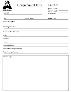
One of the orignal comps for my brief after revamping.


Another revamping. The version above was more client based and this version was more for a classroom use


Another revamping. This version included  a personal logo of mine and attempted to be more Message/Objective Specific

Company Product/Services Ad Campaign

I felt my company was more of a service provider than one that delivered actual products so this was a little difficult for me. I thought I could create some ads you would find on similar websites, possibly banner ads, a billboard, and maybe some storyboards for a possible commercial.


Some  roughed out comps:) of some ads for my company. I liked the idea of breaking the ad up into three parts. My company name has 3 parts or syllables and 3 as a number in many cultures represents completeness. As stated in my companys' positioning statement MEUWE is comprehensive which I don't think is very far from the idea of completeness.


More comps of some ads, these part of a series. The concept is focusing more on the social aspects of the company. You have just a group of friends mingling as well as some different couples who are more intimately involved displayed. I came up with the idea of "What are you looking for?" as a question posed on the ads. And then thought a little change of the sentence structure making "What you are looking for", could make a more interesting ad, slogan and overall concepts for parts of my company. It refers back to the "eye meeters" of earlier designs for one


A finalized version of an ad. This one contains the company logo, a positioning statement and call to action(website name). It incorporates pictographs from earlier designs. The pictographs are aligned with the text uniquely so that in many instances the text forms part of the figures contours. I felt this unified the ads elements more. The texts colors reflect the logos. And the "What are you looking for, What you are looking for" idea is displayed. What are you looking for, is at eye level of the man in the picture. And the lower text follows the contour of the mans arm, leading to the computer, where I would like people to go to access and utilize the companys' website.

Company Stationary

Here is some thumbnails for my company stationary. This is when my companys' positioning statement was created.


More roughs and comps for some stationary. There were several ideas here I didn't end up using but think I will in revamping some of this project in the future. The logomark is black and white for these designs. And an older idea for the website name is used. At this point I was developing ideas that my company and website names were different. The website was just one aspect of the company.


Here is a comp for an evelope design. I thought that the text info being at head level of the logo/figures worked. It was as if they were communicating, at least that was the idea. But I didn't know about some of the postal restrictions such as how close to the bottom of an envelope a mark could come so I had to change it


 Final stationary designs. I felt the more simplified look gave it a cleaner, more professional look. With the letterhead I felt that the company was still recognizable but the logo wouldn't detract from the information that may be contained

Tuesday, December 7, 2010

Company/Organization Identity


Names of some ideas for my company and its' website. Didn't feel I explored this enough, although I did gather a good amount of data on if the website names were available and their prices. My company started out as only a web company for online daters or social networkers. With the logo thumbs, there were too many dreaded acronymn attempts.


A few better ideas. The idea on the bottom left is where I came up with the design for my final logo. The letter E was for electronic and the M was for meeters as in people that meet electronically. Looking at the shapes of the E and the M it came to me that there was possiblities of creating a mark that echoed my company name using the letterforms. The counters of the E formed the heads of two figures holding hands, formed by the M letterform. But it occurred to me thinking and looking over the E and M combination that an I and an M might work better. And after a few experimentations I came up with.....


 THIS. Two I letterforms slightly tilted with another stroke extending from each of them to form "arms" of the figure. The dots of the I's are oversized as to form the "heads" of the figures. I thought the name i-meeters would work as a company because the mark contained the letters i and m and I-Meeters as in Internet Meeters. Also the inference of two peoples eyes meeting when they first meet in a social setting.


I felt it was a good mark and beginning for a logo but it was felt that the main marks of the m letterform were too thin and could be made to look more like the figures i was hoping to be inherent in the mark


 This was some experimenting with incorporating part of some of the pictographs I'd made before with the logo mark I'd come up with.

Variations of the mark with the dimensions of the letterforms changed, and with color. It was felt that the name of the website should be changed. Possibly changed to something less obvious that still reflected what the company was about. After some brainstorming came up with....


 MEUWE as in me-you-we(or us). I added a rounded shape to the middle of the M letterform to reflect shape of heads and give more of a hand appearance. I think this humanized the letterforms much more. Underneath the logo was some roughs with trying to use the logo mark in the name of the company. Unneccesary and glad I didn't go with it.


 I felt the new logo mark should have some color to it although I thought it might limit it in some ways with future web applications. I decided on some soft red and blue hues representing the female and male. I gave it a gradient mix that "met" in the middle or joined as some of the people who met through my company website might. I gave a radial gradient to the figures heads to give it some depth but it was felt this detracted from the mark which I was in aggreance with.


This was a rough for my company website page incorporating both my activity score and my logo. This rough was made using my original  logo and not the finalized version but you could still get the idea of the look. The final logo was like the red and blue one above except for the gradient was removed from the heads of the figures and the gradient of the lower part of the mark was relaxed a little